What Is The Bitcoin Rainbow Chart And How Does It Work?

The Bitcoin Rainbow Chart is a market visualization tool designed to help investors understand Bitcoin’s price movements over time. It utilizes a colorful gradient to indicate potential price levels and phases of market sentiment, allowing traders to identify when BTC may be undervalued or overvalued based on historical price data.
In this blog, we will take a closer look at the Bitcoin Rainbow Chart to learn what it is, how it works, how it can be used in your BTC trading strategy, and whether it is a reliable market analysis tool. So, without further ado, let’s get started.
What is the Bitcoin Rainbow Chart?
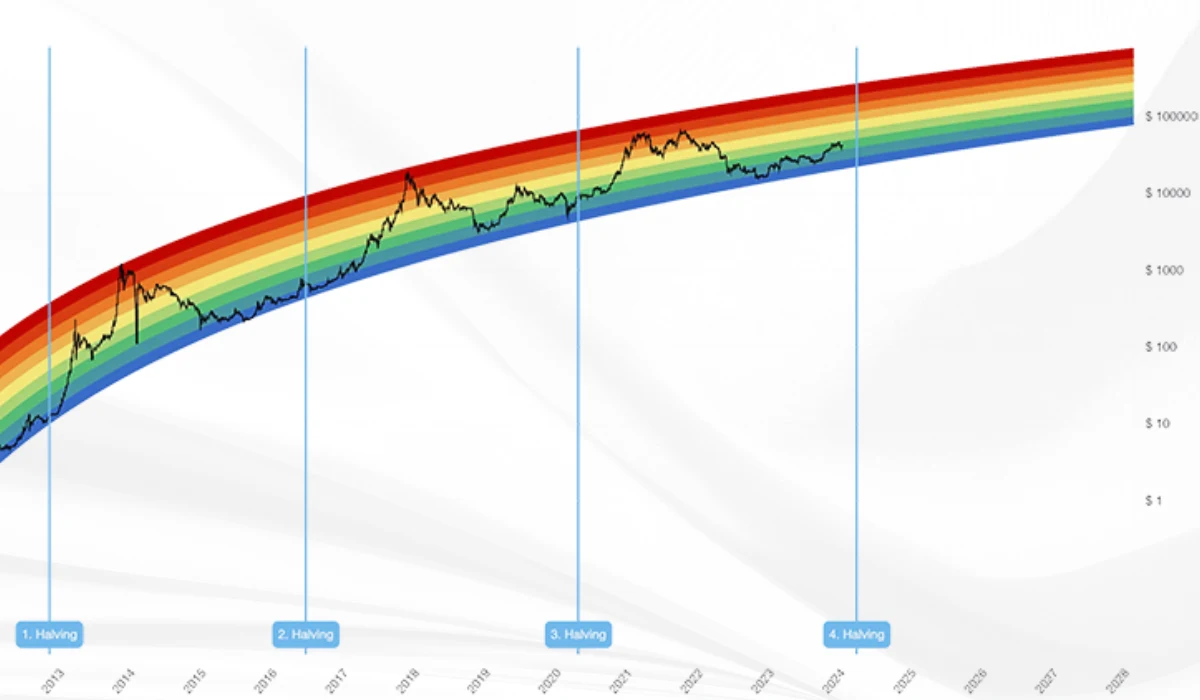
The Bitcoin Rainbow Chart is a long-term valuation tool that provides a visual representation of BTC’s historical price movements over the years through a series of rainbow-colored bands. The chart plots the price on a logarithmic scale with a series of color bands, where each color represents different phases of the Bitcoin market cycle, ranging from undervalued to overvalued levels.
The core concept of the chart is that over the years, Bitcoin has experienced significant price increases and drops, and it seeks to visualize these patterns. Investors use the tool to assess market conditions and potential future price movements. The Rainbow Chart is particularly popular among long-term holders and market newbies looking to understand the apex cryptocurrency’s historical price behavior.
How Does the Bitcoin Rainbow Chart Work?

The Bitcoin Rainbow Chart is created using historical price data and a logarithmic regression curve. The curve is then color-coded into bands that range from red at the top, indicating overvaluation, to purple at the bottom, indicating undervaluation of BTC.
Each color represents a different price range, and the position of Bitcoin within these bands helps investors gauge the current market sentiment for the asset by recognizing whether it’s in a bearish or bullish phase to make more informed decisions.
Here is what each color band on the Bitcoin Rainbow Chart represents:
- Dark Red (Max Bubble): The market is extremely overextended, and BTC’s price is likely to drop.
- Red (Sell): BTC has hit an overbought level, suggesting a potential price correction as traders may consider taking profits.
- Dark Orange (FOMO): Buyers are dominating the market, and “Fear of Missing Out” (FOMO) is in full effect as BTC is approaching overbought conditions, warranting caution.
- Light Orange (Is this a Bubble?): The market is balanced, and there is no clear indication of whether to buy or sell BTC.
- Yellow (HODL): Bitcoin’s price is stabilizing, indicating a neutral market as it is neither undervalued nor overvalued. Investors should “hold on to dear life.”
- Light Green (Still Cheap): Bitcoin is relatively cheap, a potential buying opportunity.
- Green (Accumulate): BTC is undervalued, suggesting a buying opportunity.
- Light Green (Buy): Perfect time to accumulate more Bitcoin, as it is undervalued.
- Blue (Fire Sale): BTC is highly undervalued, often seen as an ideal market entry point for long-term holders.
- Purple (Dead Market): Extreme undervaluation, indicating that Bitcoin’s price has bottomed.
How to use the Bitcoin Rainbow Chart?
Investors can effectively use the Bitcoin Rainbow Chart by incorporating it into their broader market analysis strategy. The core concept of the chart is pretty straightforward: if price is in the cooler zones of blue or green, it is a good time to buy, as BTC is likely to be undervalued compared to historical trends.
Conversely, if the chart is in the warm zone of red and dark red, it is a signal that the market is overheated, and the wiser approach is to take profits.
While it is a handy tool for visualizing long-term trends, it shouldn’t be the sole determinant of investment decisions. We suggest that you combine the insights from the Bitcoin Rainbow Chart with other market indicators to enhance your understanding of potential price movements.
Investors can better utilize the Rainbow Chart by:
- Regularly monitoring it to stay updated on Bitcoin’s current position within the bands.
- Comparing historical price movements with current trends to identify patterns, and using the chart in conjunction with other technical tools for a comprehensive market analysis.
- staying informed about market sentiment and developments that affect Bitcoin’s price
- Being prepared to adjust their investment strategy based on the insights gathered from the chart.
Relation Between the Bitcoin Rainbow Chart and Bitcoin Halving
A key aspect of the Bitcoin Rainbow Chart is its close relationship with the block reward halving events on the Bitcoin network, which occur after every 210,000 blocks mined or roughly every four years.
During a Bitcoin halving, the BTC rewards miners receive for adding new blocks to the blockchain are reduced by half. This is significant because it decreases the rate at which new bitcoins are issued, creating scarcity while driving up the price.
Historically, around the time of halving, Bitcoin’s price tends to be in the lower bands of the Rainbow Chart, before climbing towards the upper bands in the subsequent years.
However, to date, Bitcoin has only undergone four halving cycles, so it is important to note that more consistent patterns will be necessary to cement this as a credible price indicator on the Rainbow Chart.
Is the Bitcoin Rainbow Chart Reliable?
The Bitcoin Rainbow Chart is a useful market analysis tool based on historical price data and assumptions, but it is not the most reliable. While it can provide valuable market insights, it should not be the only technical factor guiding your investment decisions.
Bitcoin’s price is influenced by various factors, and the color bands on the Rainbow Chart react accordingly, yet they do not reflect the current market state or future price expectations with certainty.
With that being said, the chart is helpful to investors as a reference tool, especially for those looking to understand Bitcoin’s current market position and where its price could be headed based on the broader crypto market cycle.
Conclusion
The Bitcoin Rainbow Chart serves as a visual tool to understand Bitcoin’s historical price movements and forecast the market sentiment. Investors interpret the various color bands on the logarithmic chart to gain market insights and make more informed investment decisions.
When BTC price is within the cooler bands, it might be a good time to consider buying, and on the other hand, when the price is in the warmer bands, it could be time to take some profits by offloading your coins.
However, keep in mind that the chart is best used as a long-term guide rather than a short-term trading signal. When used in conjunction with other market analysis tools, the Rainbow Chart can provide a valuable perspective on Bitcoin’s potential price trajectory.
Another point to note is that BTC price can be incredibly volatile in the short term, so it is advisable to approach it with a long-term mindset and not get too caught up in its day-to-day fluctuations.
As is the case with any investment, education and market awareness are key to achieving success in the long run. The contents of this article are for informational purposes and should not be construed as investment advice.

Crypto & Blockchain Expert